Week 3: Visualisation of Spatial Data (1) – RDS – ggplot2
1 ggplot2
From Wikipedia and R-project website, ``ggplot2 is a data visualization package for the statistical programming language R. Created by Hadley Wickham in 2005, ggplot2 is an implementation of Leland Wilkinson’s Gurky Gang—a general scheme for data visualization which breaks up graphs into semantic components such as scales and layers. ggplot2 can serve as a replacement for the base graphics in R and contains a number of defaults for web and print display of common scales. Since 2005, ggplot2 has grown in use to become one of the most popular R packages.”
It is a general framework for data visualisation, and in this class, we will use it to visualise spatial data and spatio-temporal data.
- Please study Chapter 9 of the book R for Data Science (https://r4ds.hadley.nz/).
- 9.1 — 9.3: required
- 9.4 — 9.6: optional
- 9.7: I will talk about this in Week 6 lab
2 Layers
library(tidyverse)An Example
f = lm(hwy~displ, data = mpg)
ggplot(data = mpg, mapping = aes(x = displ, y = hwy)) +
  geom_point()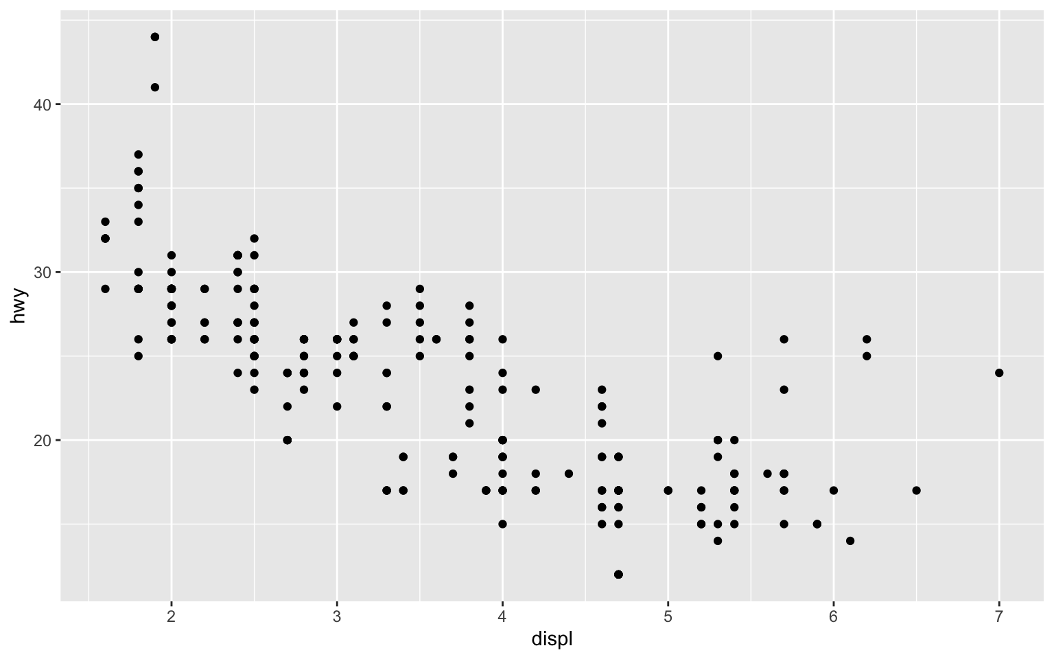
Add one more layer (the line)
ggplot(data = mpg, mapping = aes(x = displ, y = hwy)) +
  geom_point(color = "blue") +
  geom_abline(slope = f$coef[2], intercept = f$coef[1])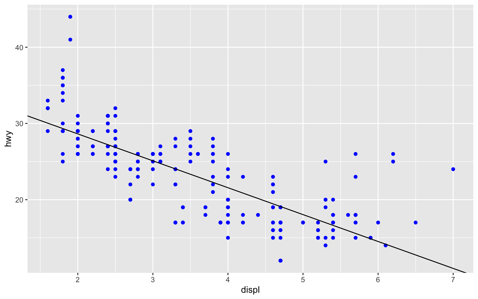
with different colors
mpg$cyl = factor(mpg$cyl)
ggplot(data = mpg, mapping = aes(x = displ, y = hwy)) +
  geom_point(aes(color = cyl, shape = cyl)) +
  geom_abline(slope = f$coef[2], intercept = f$coef[1])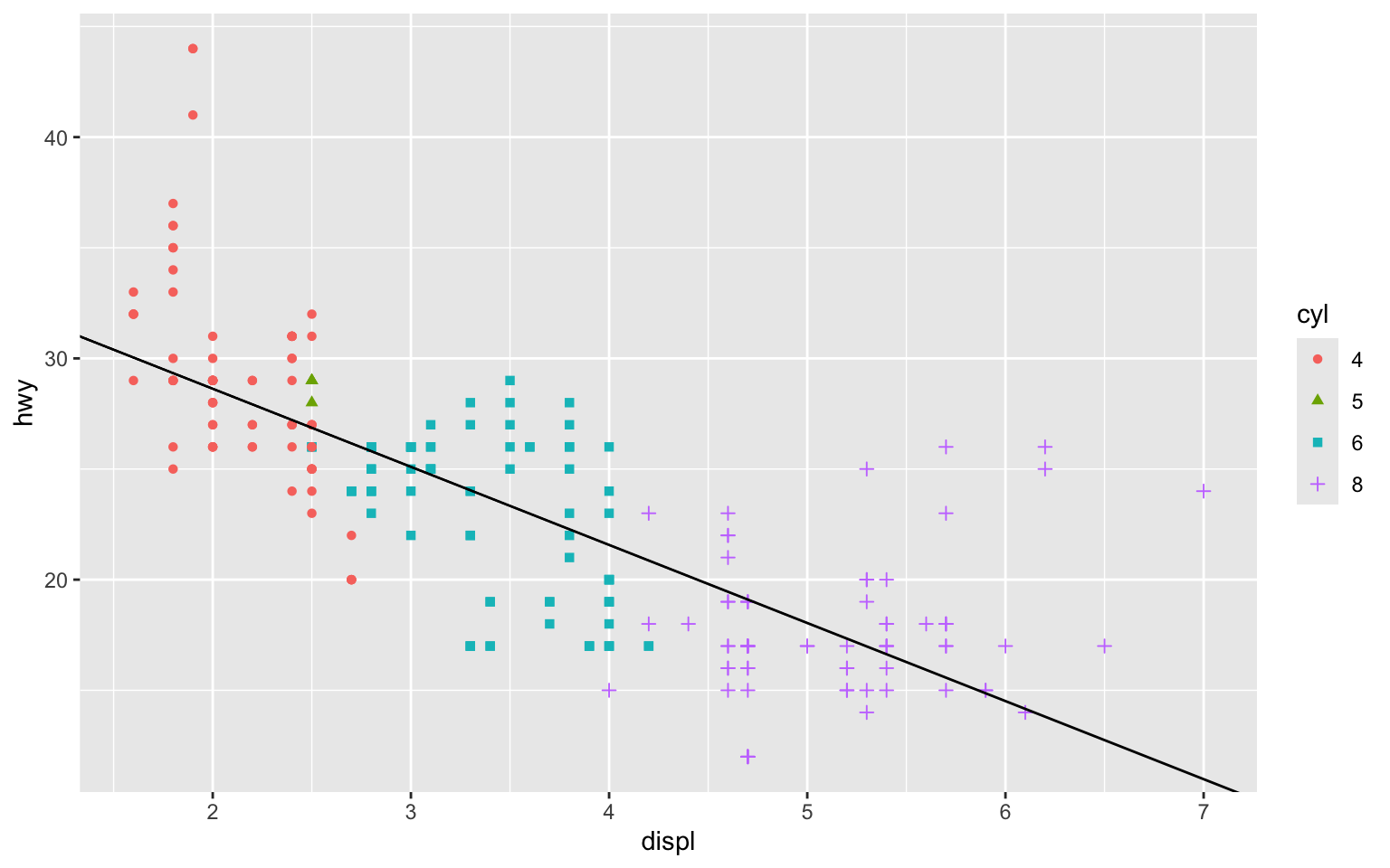
3 Others
- Starting Points
- 9.2 ggplot, aes
- 9.3 geom_point, geom_line (geom_abline), color
- More Advanced
- 9.4 facet_wrap, facet_grid
- 9.5 geom_bar
4 Exercise
Visualize the daily pattern of mel_sel data.