Solutions
1 Week 3
1.1 Visualize the daily pattern of mel_sel data.
library(lubridate)
library(dplyr)
library(tidyr)
library(ggplot2)
load("datasets/melb_sel.Rdata")
head(melb_sel)## # A tibble: 6 × 2
## date counts
## <dttm> <dbl>
## 1 2019-06-01 00:00:00 6.74
## 2 2019-06-01 01:00:00 6.33
## 3 2019-06-01 02:00:00 6.01
## 4 2019-06-01 03:00:00 5.28
## 5 2019-06-01 04:00:00 4.75
## 6 2019-06-01 05:00:00 4.49mel_d_avg = melb_sel |> mutate(wday = wday(date, label = TRUE), hour = hour(date)) |> group_by(hour) |>
summarise(avg_counts = mean(counts))
ggplot(mel_d_avg, aes(x = hour, y = avg_counts)) + geom_line()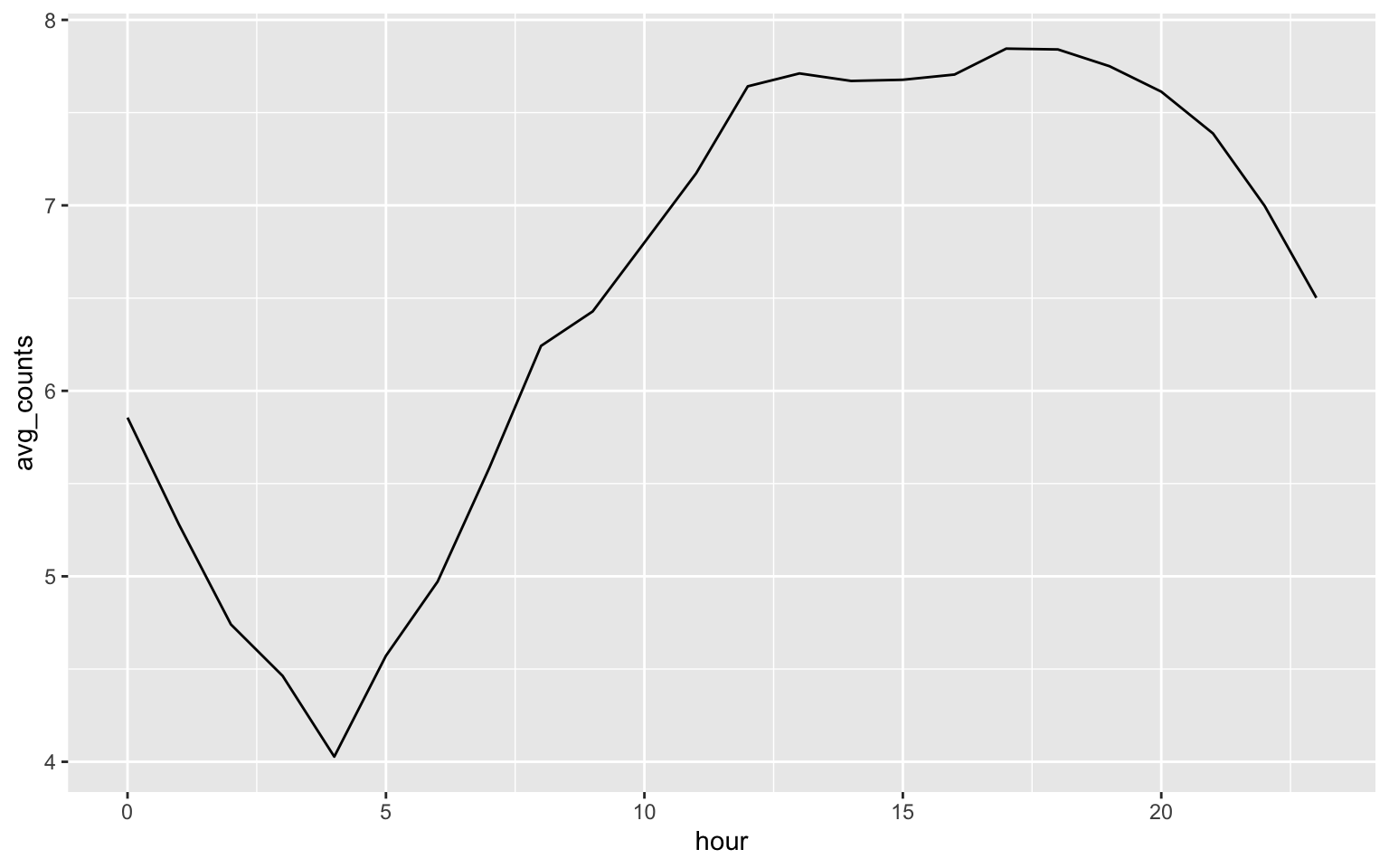
1.2 (Optional) If you want to visulize the weekly pattern.
melb_w_avg = melb_sel |> mutate(wday = wday(date, label = TRUE), hour = hour(date)) |>
  group_by(wday, hour) |> summarise(avg_counts = mean(counts))
melb_w_avg$mdayh = melb_sel$date[1:168]
melb_w_avg |>
  ggplot(aes(x = mdayh, y = avg_counts)) + geom_line() +
  scale_x_datetime(date_labels = "%a %H:%M:%S", date_breaks = "1 day")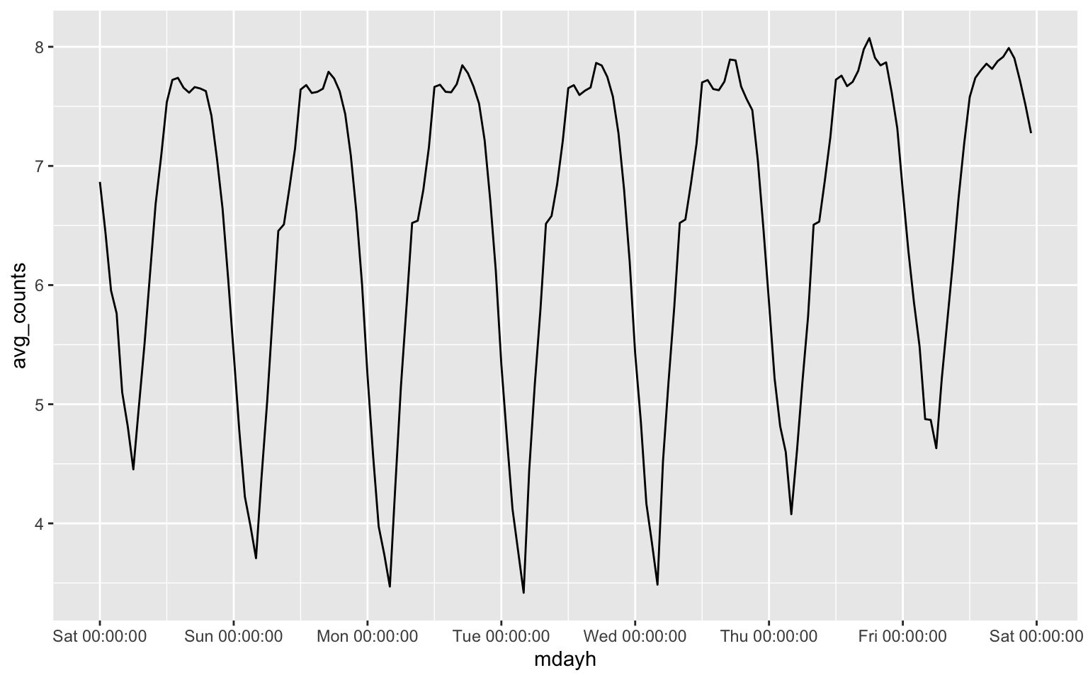
2 Week 4
Question: What is the expected number of events?
Answer: \[\lambda \nu(D) = 100\times 4 = 400. \]
Question: What do you conclude from the above plot?
Answer: We fail to reject the null hypothesis since the estimated G function is inside the envelope.
Question: Can you test rNS data whether it follow clustered point pattern?
library(spatstat)## Loading required package: spatstat.data## Loading required package: spatstat.geom## spatstat.geom 3.2-9## Loading required package: spatstat.random## spatstat.random 3.2-3## Loading required package: spatstat.explore## Loading required package: nlme##
## Attaching package: 'nlme'## The following object is masked from 'package:dplyr':
##
## collapse## spatstat.explore 3.2-6## Loading required package: spatstat.model## Loading required package: rpart## spatstat.model 3.2-10## Loading required package: spatstat.linnet## spatstat.linnet 3.1-4##
## spatstat 3.0-7
## For an introduction to spatstat, type 'beginner'set.seed(2025)
nclust <- function(x0, y0, radius, n) {
return(runifdisc(n, radius, centre=c(x0, y0)))
}
rNS = rNeymanScott(kappa=10, expand=0.1,
rcluster = nclust, radius=0.1, n=10)
r=seq(0,1, by=0.005)
Gtest=envelope(rNS,fun=Gest, r=r, nrank=5, nsim=200)
plot(Gtest, xlim = c(0,0.1))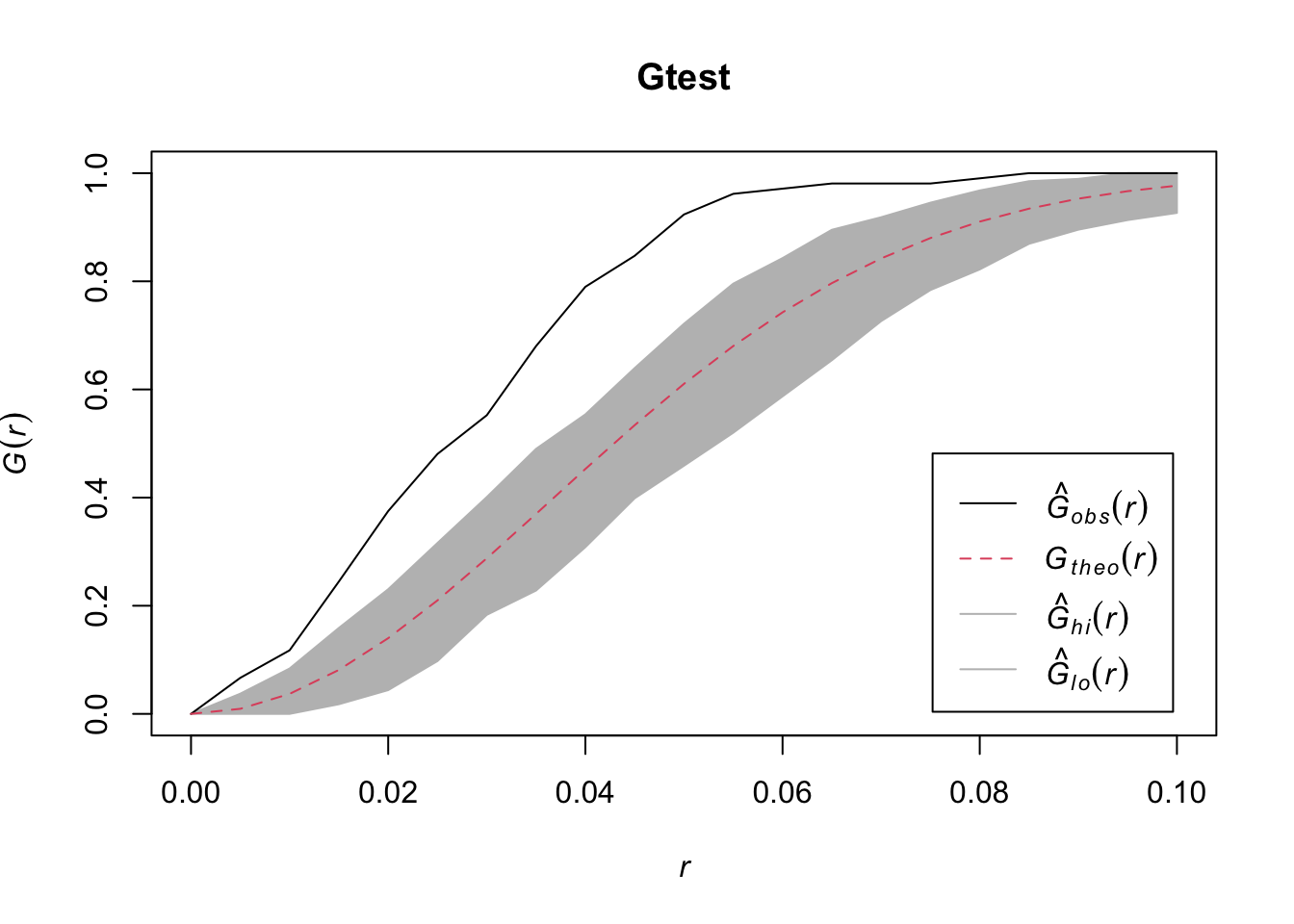
## Generating 200 simulations of CSR  ...
## 1, 2, 3, 4.6.8.10.12.14.16.18.20.22.24.26.28.30.32.34
## .36.38.40.42.44.46.48.50.52.54.56.58.60.62.64.66.68.70.72.74
## .76.78.80.82.84.86.88.90.92.94.96.98.100.102.104.106.108.110.112.114
## .116.118.120.122.124.126.128.130.132.134.136.138.140.142.144.146.148.150.152.154
## .156.158.160.162.164.166.168.170.172.174.176.178.180.182.184.186.188.190.192.194
## .196.198.
## 200.
##
## Done.
quadrat.test(rNS, nx = 4, ny= 4, alternative = "clustered", method = "Chisq")##
## Chi-squared test of CSR using quadrat counts
##
## data: rNS
## X2 = 134.67, df = 15, p-value < 2.2e-16
## alternative hypothesis: clustered
##
## Quadrats: 4 by 4 grid of tilesBoth methods conclude rNS data follow a clustered point pattern.
3 Week 8
library(geoR)## --------------------------------------------------------------
## Analysis of Geostatistical Data
## For an Introduction to geoR go to http://www.leg.ufpr.br/geoR
## geoR version 1.9-4 (built on 2024-02-14) is now loaded
## --------------------------------------------------------------dfgeo = readRDS("datasets/dfgeo.rds")
dfgeo$x = dfgeo$long * 79
dfgeo$y = dfgeo$lat * 111
idx = seq(1, length(dfgeo$x), 5)
dfgeo_test = dfgeo[idx, ]
dfgeo_train = dfgeo[-idx,]
dfgeodata = as.geodata(dfgeo_train, coords.col=5:6, data.col=4, covar.col = 1:3)
plot(variog(dfgeodata, option="bin", max.dist=900),
xlab = "h", ylab = "variogram")## variog: computing omnidirectional variogramlines.variomodel(seq(0, 900, l = 100),
cov.pars = c(0.8, 200),
cov.model = "mat", kap = 0.6, nug = 0.1)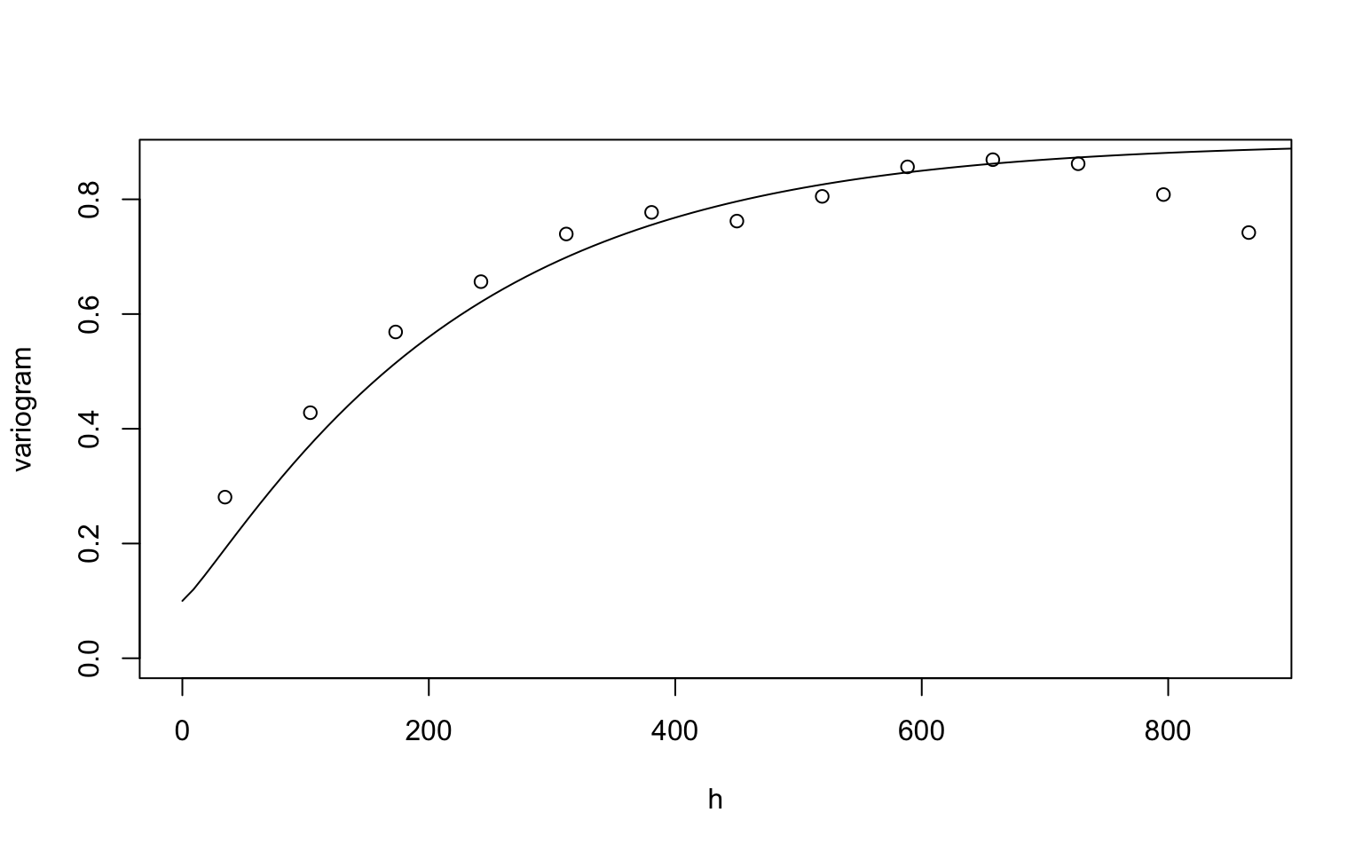
m4 = likfit(dfgeodata, ini = c(0.8, 200), nug = 0.1, cov.model = "matern", fix.kappa = FALSE, kappa = 0.6)## ---------------------------------------------------------------
## likfit: likelihood maximisation using the function optim.
## likfit: Use control() to pass additional
## arguments for the maximisation function.
## For further details see documentation for optim.
## likfit: It is highly advisable to run this function several
## times with different initial values for the parameters.
## likfit: WARNING: This step can be time demanding!
## ---------------------------------------------------------------
## likfit: end of numerical maximisation.summary(m4)## Summary of the parameter estimation
## -----------------------------------
## Estimation method: maximum likelihood
##
## Parameters of the mean component (trend):
## beta
## -0.2354
##
## Parameters of the spatial component:
## correlation function: matern
## (estimated) variance parameter sigmasq (partial sill) = 0.7465
## (estimated) cor. fct. parameter phi (range parameter) = 200
## (estimated) extra parameter kappa = 0.3045
## anisotropy parameters:
## (fixed) anisotropy angle = 0 ( 0 degrees )
## (fixed) anisotropy ratio = 1
##
## Parameter of the error component:
## (estimated) nugget = 0.0275
##
## Transformation parameter:
## (fixed) Box-Cox parameter = 1 (no transformation)
##
## Practical Range with cor=0.05 for asymptotic range: 484.5776
##
## Maximised Likelihood:
## log.L n.params AIC BIC
## "-643.1" "5" "1296" "1319"
##
## non spatial model:
## log.L n.params AIC BIC
## "-968" "2" "1940" "1949"
##
## Call:
## likfit(geodata = dfgeodata, ini.cov.pars = c(0.8, 200), nugget = 0.1,
## fix.kappa = FALSE, kappa = 0.6, cov.model = "matern")